Intel’s new logo — Explained.

Good-bye circles, Hello Squares. Concisely, this has been the mantra this time around for Intel.
The semiconductor giant has given its logo a refreshed look, just for the fourth time in its 51 years of operation. This also marks the end of its Intel wordmark enclosed in a circular swirl logo, which was in use since 2006.

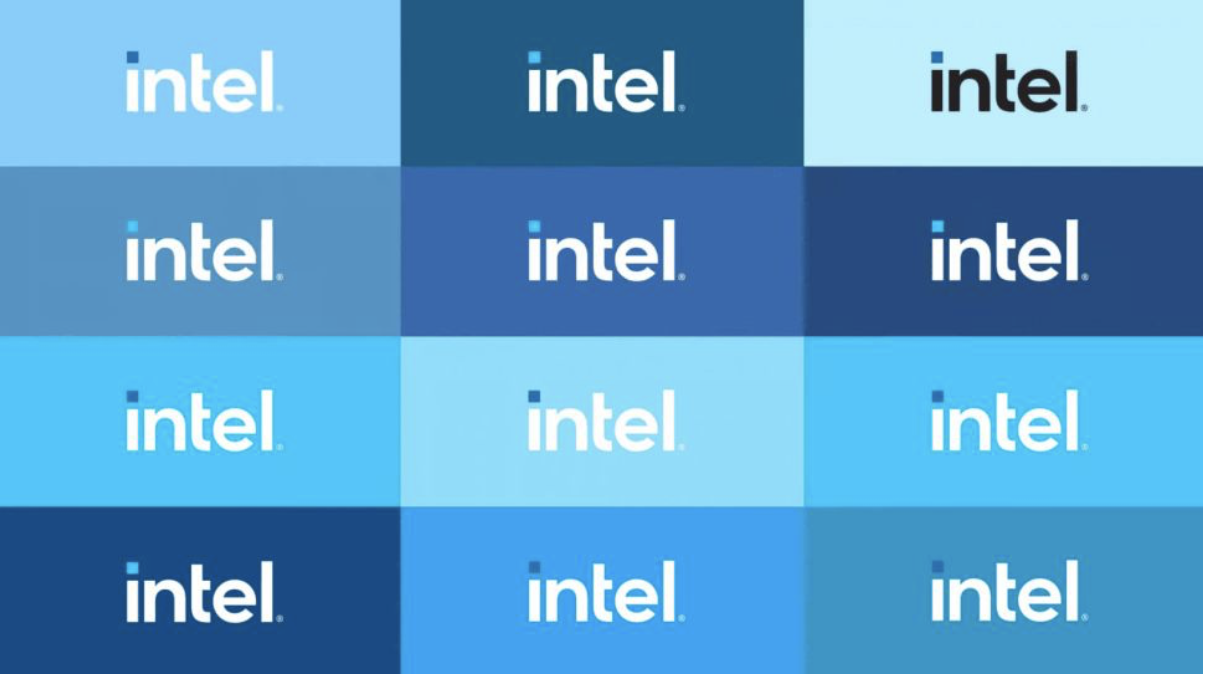
The color palette remains blue-toned but brighter and with extended variants. It’s a gorgeous set of blues when placed side-by-side, as in the picture below. Atop the ‘i’ is a square dot, which represents a processor, and is a different shade of blue in every setting. As per Intel’s Chief Marketing Officer Karen Walker, the redesigned logo is more modern and brings “dimension and breadth” to the brand.
Why change the logo anyways?
Any company in its initial days wants to get recognized. One of the easier ways to get recognition is by getting innovative and decorative with your logo.
Companies like Samsung, Oppo, or Microsoft in their initial years had a very vibrant theme or had a very unusual look to stand out in front of the customers. For instance, Samsung had a slanted oval background while Oppo had a fancy green font.

But over the years, these companies have acquired a huge market and hence they have shifted to a more minimalist logo. Now their names speak for themselves and don’t need a funkier or eye-catchy logo anymore.

What can be the reason for the logo change?
To figure out why Intel would have changed their logo now in 2020 has to do more with the recent operations at Intel and the competition it is facing.
Intel has announced that its 7nm processor will suffer a six-month delay. Another processor rival AMD saw its share price overtake Chipzilla’s, and on top of that, Intel is involved in a class-action lawsuit for investors fraud.
Apple (AAPL) recently announced it will phase out its Intel chips in MACs in favor of its own ARM-based chips. So, it is safe to say that the company has had a few rough weeks this year.
What does the logo signify for Intel?
Intel’s new brand comes as a decisive moment for Intel. If it can keep the competition at bay, it might be remembered as the logo when Intel overcame the biggest period of adversity in its history.
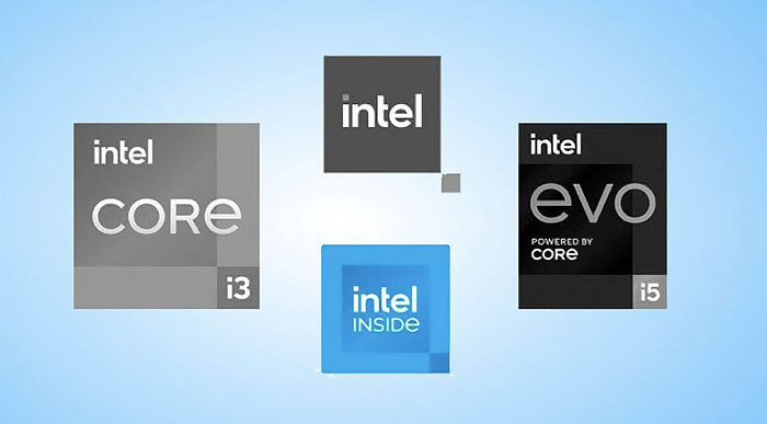
The rebrand comes alongside the unveiling of its new 11th generation Core PC processors, and a new chip brand, Evo (stands for Evolution). Though slick, is the updated design enough to take it into a new era of competition? Only time will tell.
The iconic five notes “bong” update
Beyond the logo, the company is set to launch a “modernized” new sound for the bong, later this year. It has confirmed that it will retain the iconic five notes that are recognized around the world.
